OVERVIEW
Sleep Number would undergo its most significant rebrand to date, aimed at simplifying their product line and adding a focus around immersive shopping and a comfort first marketing approach.
YEAR
2026
ROLE
UX Designer
TEAM
5 Developers · 2 Project managers · 1 UX researcher · 1 Graphic designer · 1 UX Manager · 1 UX designer (Me)
TOOLS
Figma · Figma Make · FigJam · Excel · UserTesting
CONTEXT
Sleep Number was ongoing their biggest product and marketing rebrand in its history. As a part of this redesign, I worked closely with my UX manager, developers and project managers to ensure a redesign of key pages in the shopping flow (mattress landing page + mattress collection product description pages). Ensuring ease of funnel progression, purchase confidence and ease of information consumption.
AREAS OF FOCUS
Problem
Components and shopping flow was previously built for different product lineup and lacked adequate content for describing key product information and ample information discovery to match customer needs.
Goals
Simplify product architecture
Consolidate the product line from 5 collections (11 models) to 3 collections (7 models) to reduce complexity and improve decision-making.
Improve product differentiation
Clearly communicate differences across the lineup to support comparison and feature understanding.
Streamline configuration experience
Create a seamless configuration flow that reduces friction and supports personalized purchase decisions.
Optimize for mobile-first behavior
Design a mobile-first experience that aligns with customer behavior and improves accessibility across devices.


RESEARCH PROCESS
How do we redesign our shopping experience to meet business rebranding + product consolidation needs, while also ensuring customers can easily understand our product lineup and confidently shop our products?
Usability research
Facilitated usability tests on existing and redesigned shopping experiences to uncover pain-points and gather key insights.
Market research
Conducted market research on key parts of other shopping flows to identify best practices and common patterns.
Identify content needs
Discovering our content needs by documenting identified pain points and matching with what we need to focus on during the redesign.
INSIGHTS
Types of shoppers discovered in usability studies
Usability testing revealed two shopper types: price-driven comparers and deep-research driven users seeking deeper product understanding through visuals, materials, and external sources. Often times customers could be a mixture of both.

Comparing based on price
Compare models primarily on price, asking “why is this more expensive?” Relying heavily on comparison tools to find info.

Deep info seeking explorer
Seek a deeper understanding of how products work and what they are made of. Relying on visuals, and feature callouts.
Mattress landing page findings
Testing found two key areas on the mattress landing page that needed attention citing lack of key information and information display being confusing and not fulfilling decision making needs for funnel progression.
Lack of key info on series cards
Users struggled to differentiate models, finding the copy unclear and instead seeking key details like size and feature highlights.
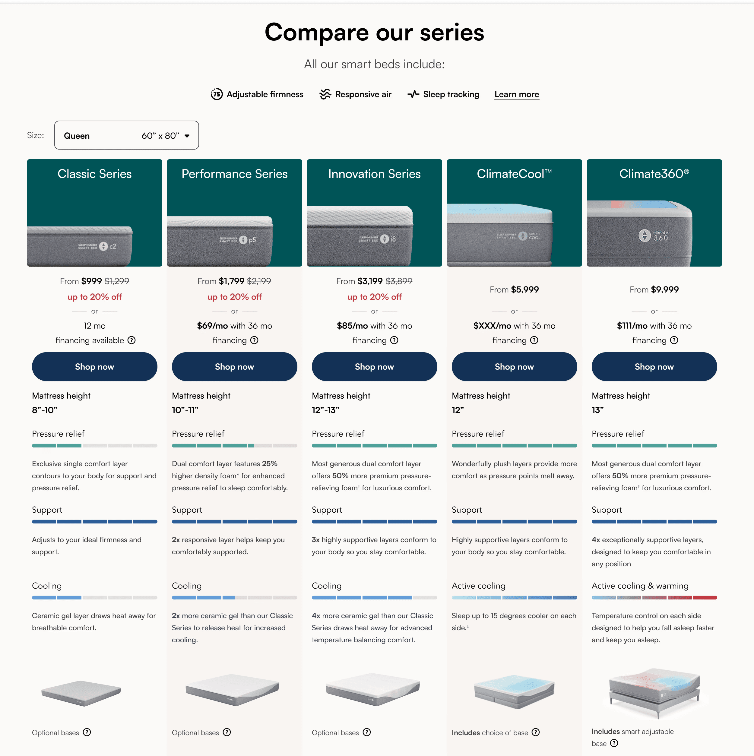
Comparison charts (scroll on image)
Comparison charts contained some key info like comparison points and mattress height, but came off as wordy and charts were confusing to some.
Mattress product description page findings
Testing found two key areas on the mattress landing page that needed attention citing lack of key information and information display being confusing and not fulfilling decision making needs for funnel progression.
Long scroll on configurator (scroll on images)
Excessive scrolling from tall selection cards in configurator section overwhelmed participants and negatively impacted decision making. (model: 764px, base: 1278px).
Base selection image was confusing
Pricing confusion arose from base imagery showing the selected model with a base/frame, resembling gallery images and leading users to assume it was the full price.
No way to dive deeper into mattress prodcuts
Participants wanted to understand mattress materials and functionality, Market research uncovered competitors using interactive graphics to showcase layers.
Confusion around base feature callouts
Feature callouts using marketing terms and a lack of deeper understanding of how said features could be useful made decision making difficult.
Key findings
Unclear product differentiation slowed decisions
Users struggled to understand differences between models, with unclear copy and over-reliance on specs making comparison difficult.
Info hierarchy & layout created cognitive overload
Excessive scrolling, dense comparison tables, and unclear prioritization of key details overwhelmed users and hindered progression.
Visual and pricing inconsistencies led to confusion
Users struggled to understand base options due to gallery-like imagery and unclear context, making selections and pricing confusing to interpret.
Lack of deep-level info = limited confidence
Users sought to understand materials and functionality, but the experience lacked intuitive, visual ways to explore how products work.
SOLUTION
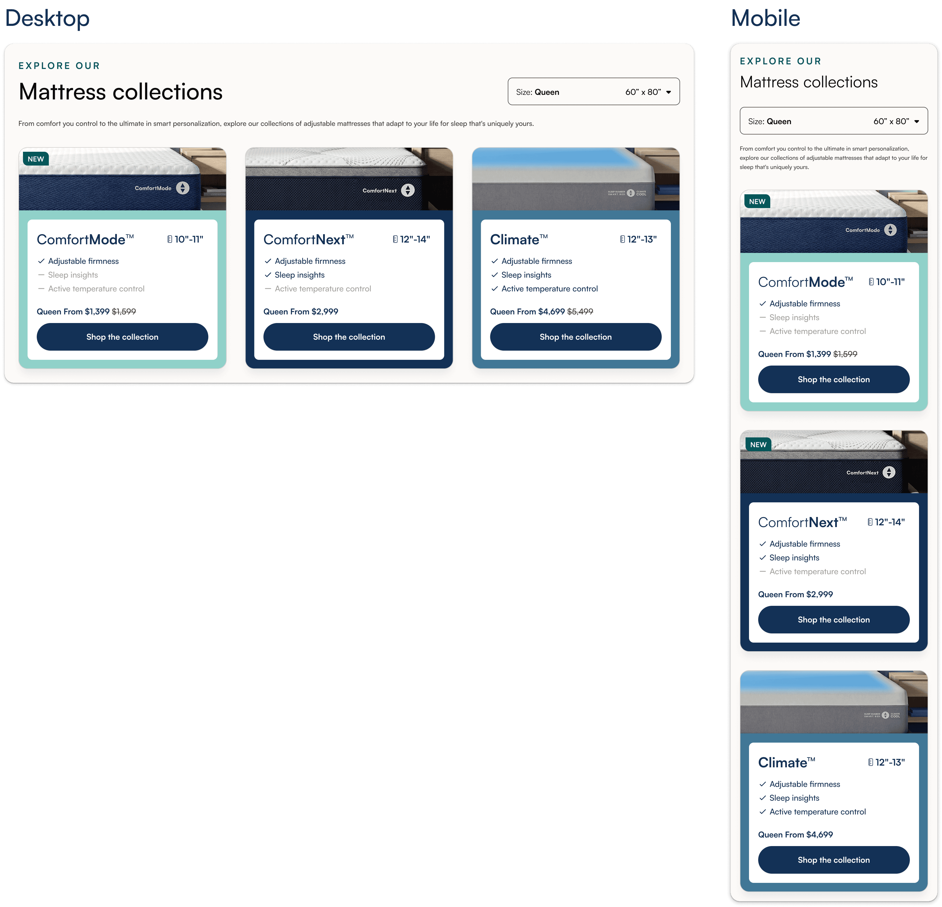
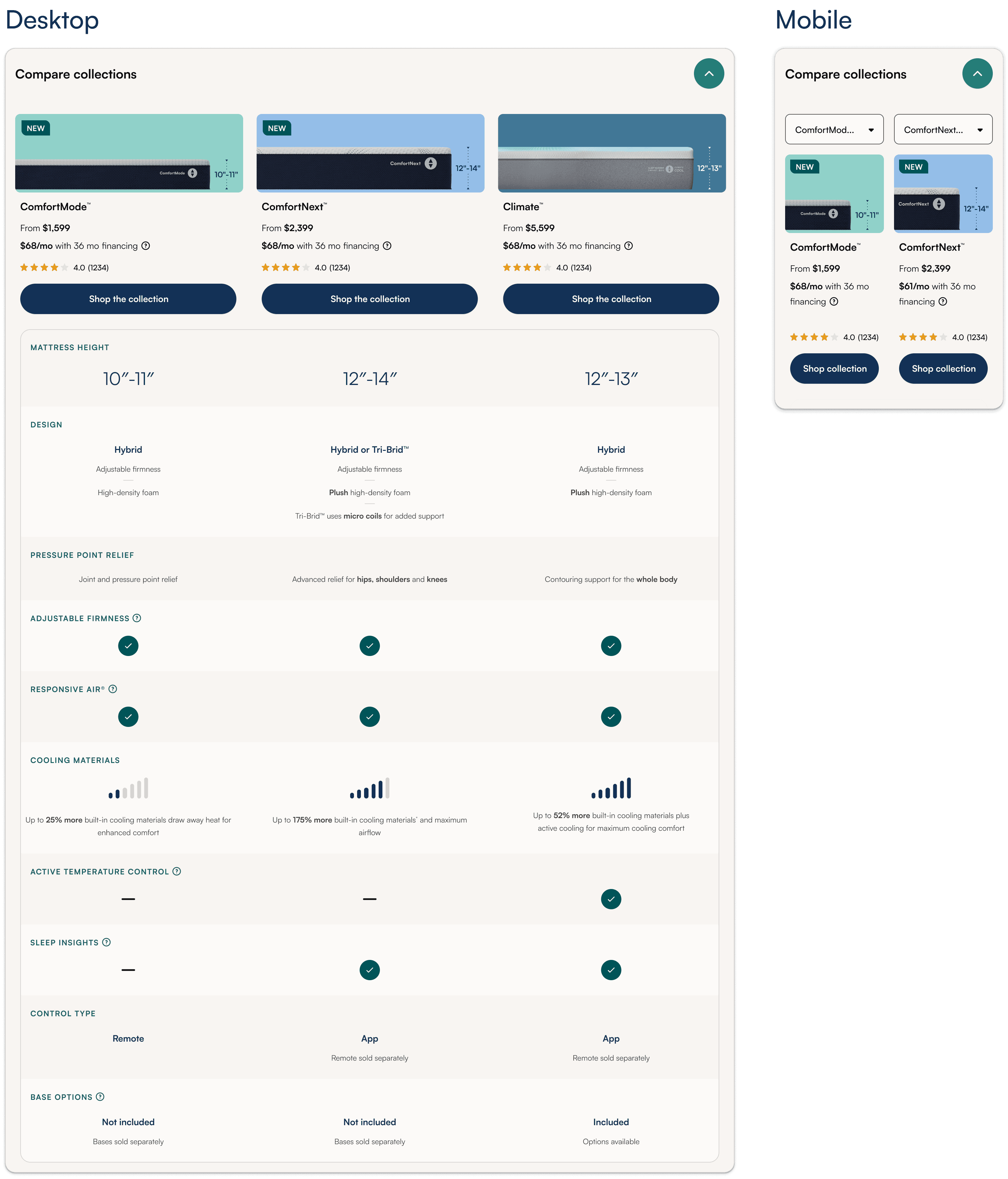
Mattress landing page (scroll to explore)

Mattress product description page
DESIGN DECISIONS
Mattress landing page
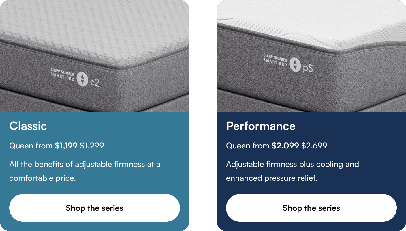
Highlight key features on collection cards
Through iteration with product and marketing, we kept cards high-level and moved detailed information to the comparison chart, highlighting key specs (height, price by size, and core features) to create a clear step-up narrative.
Display of key features on comparison chart
Using usability and market insights, we partnered with product and marketing to define clear, actionable comparison points that build purchase confidence. We tested icon-based vs. bar chart comparisons, with the icon-based approach outperforming. A collapsed-by-default chart further improved progression to PDPs.
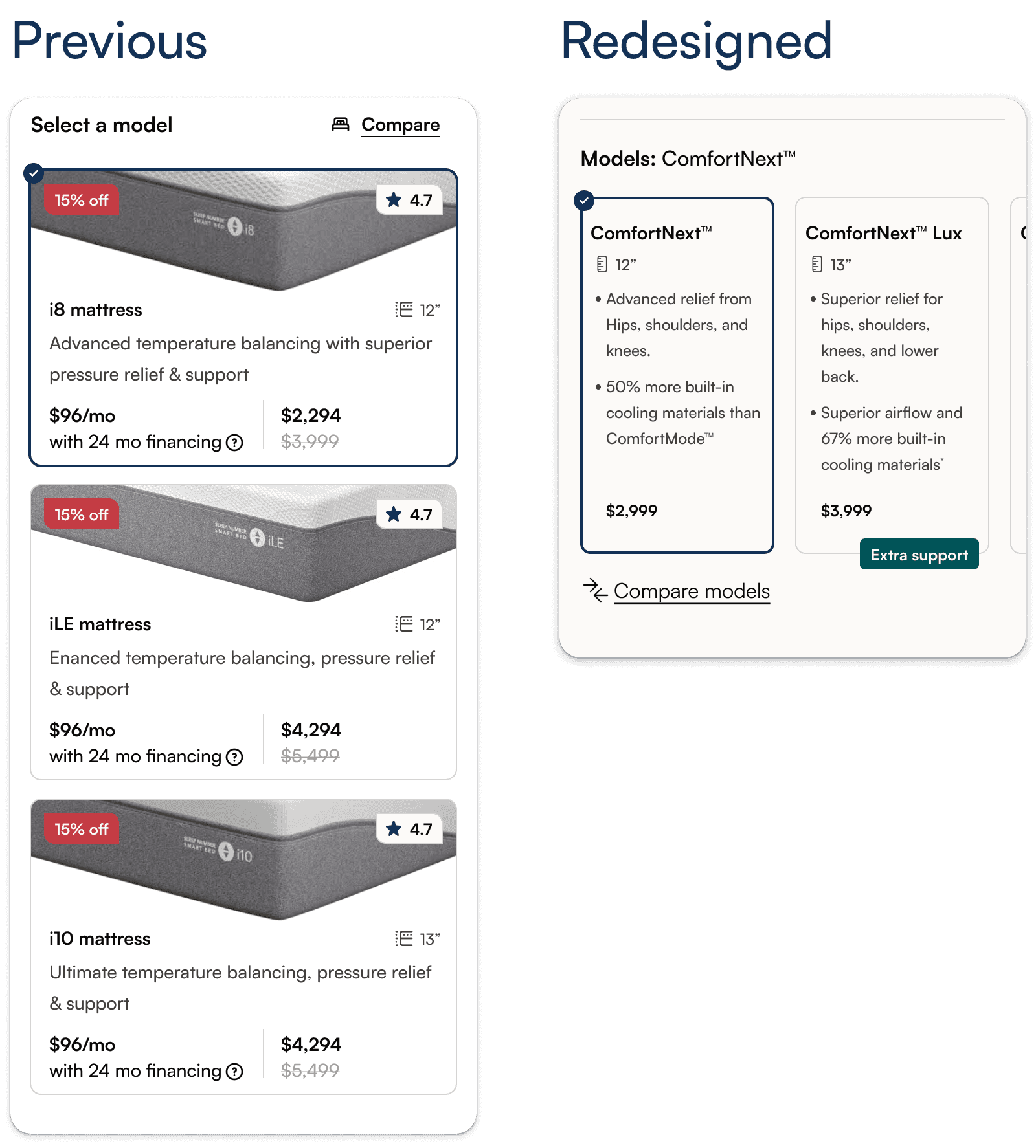
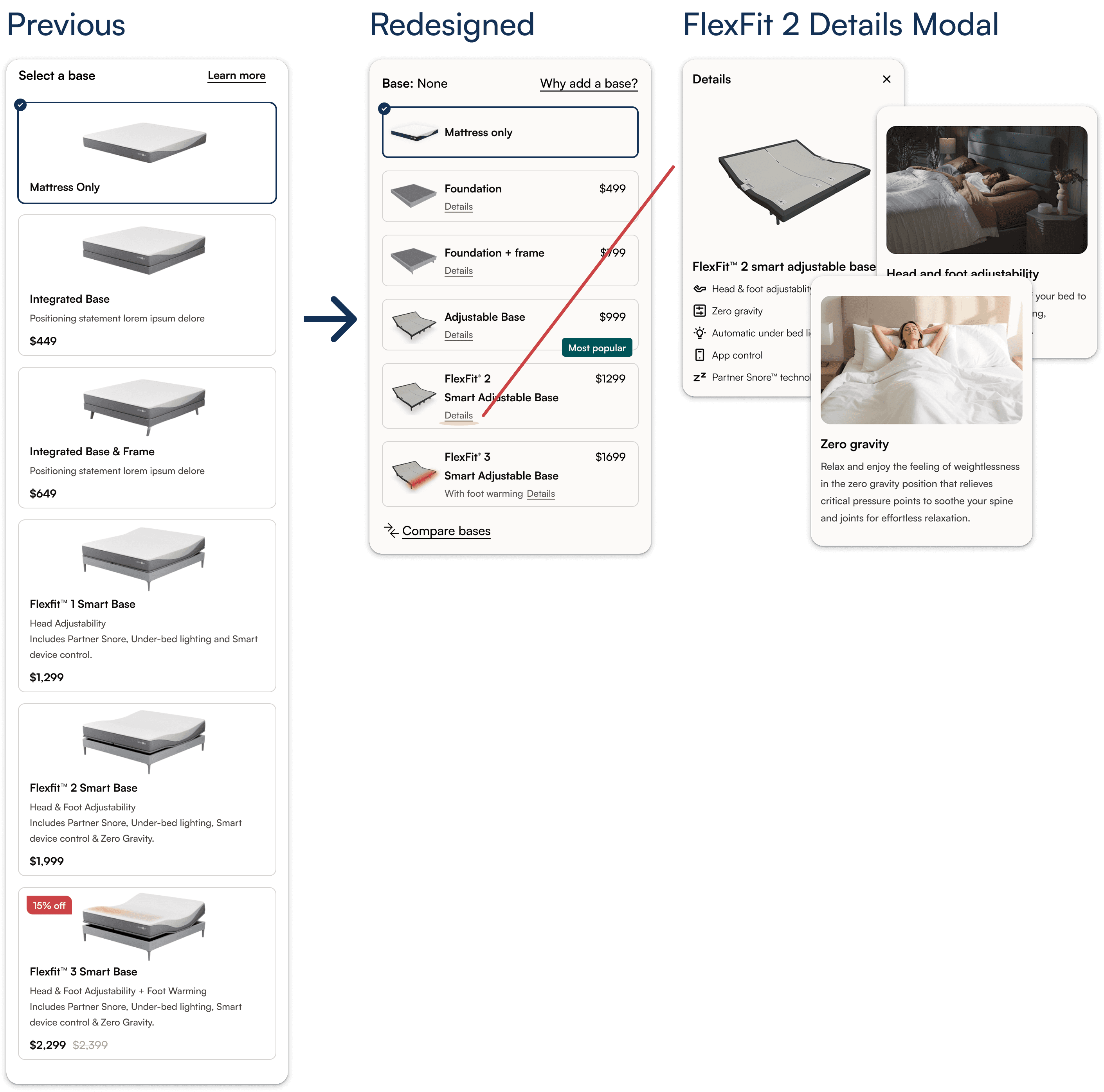
Product description page
Dynamic sticky image + seperate carousel
Made the experience more immersive by keeping product image sticky through configuration and updating dynamically with user selections, rather than keeping images within selection cards, while maintaining persistent access to a model-specific gallery.
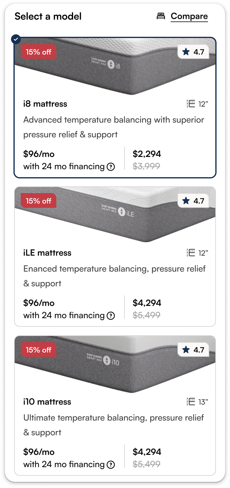
Model selection cards
Leveraging the dynamic product image to show selected models meant we could use this to highlight model differences by highlighting comparison points based on areas of the body effected and making the space taken up significantly less.
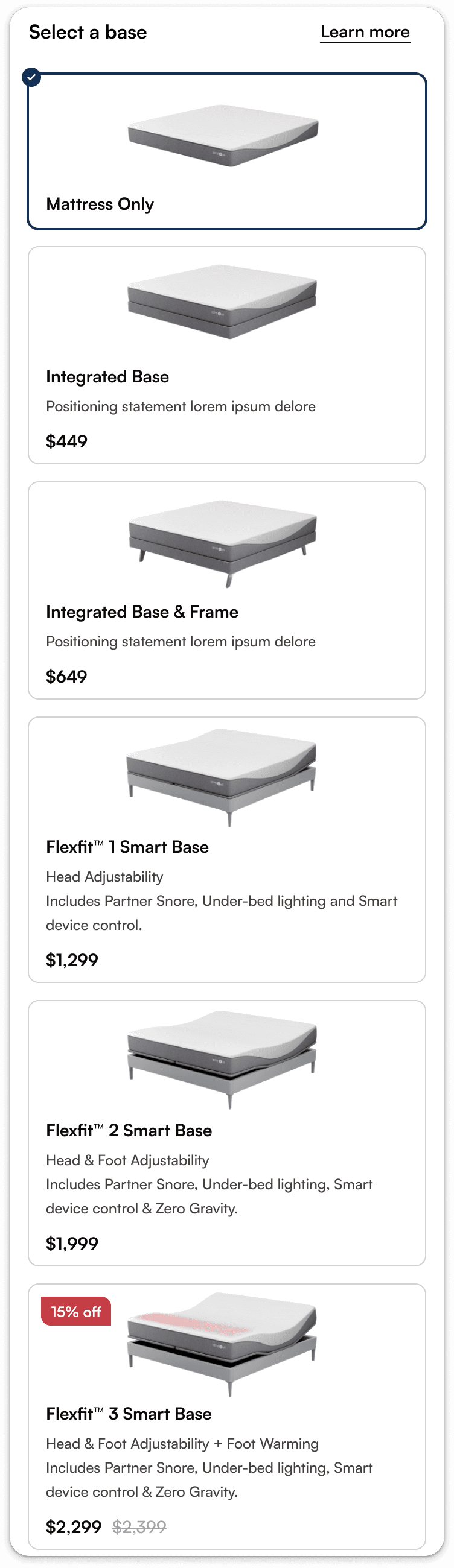
Base selection cards
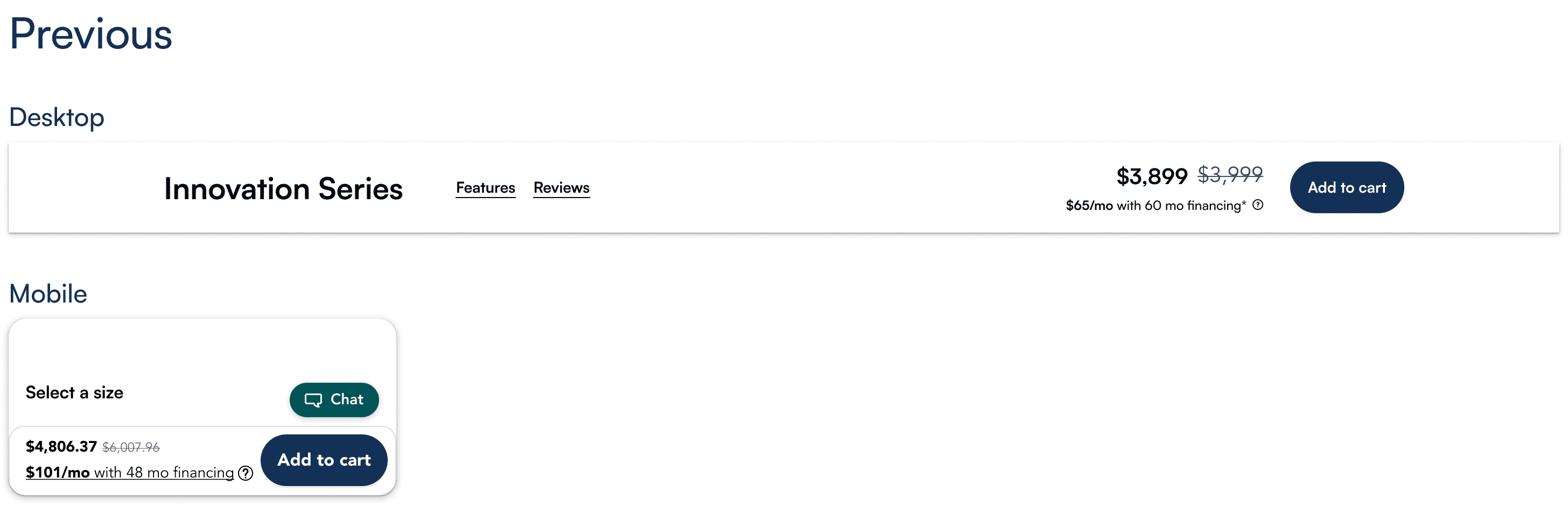
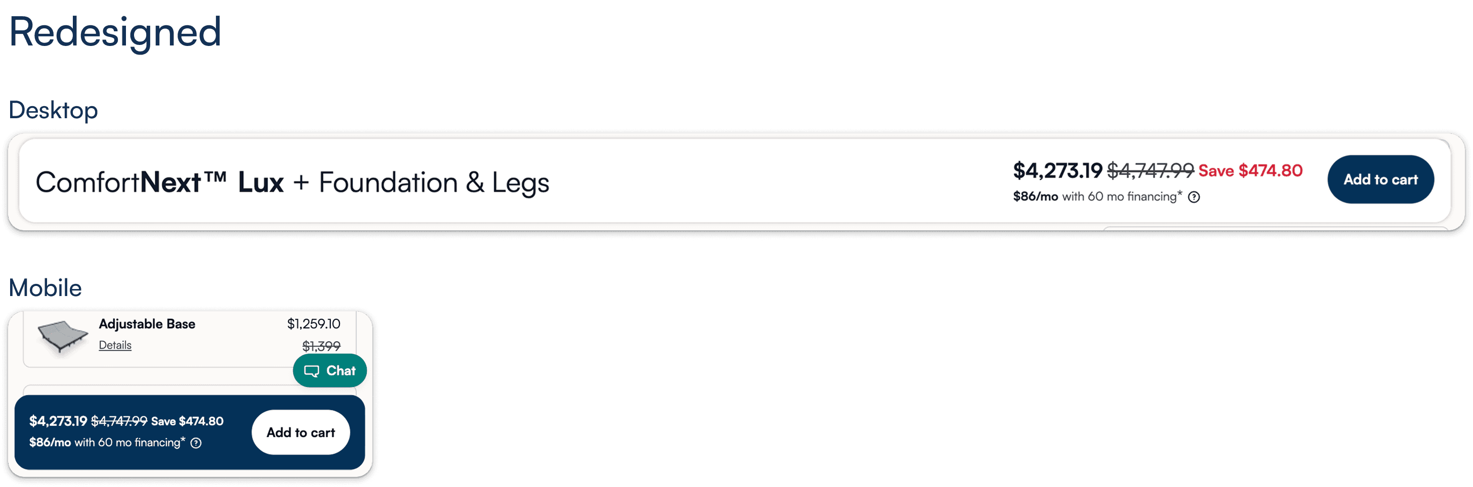
Focusing pricing and imagery on the base (vs. full configuration) reduced vertical space and allowed for us to surface more options within the viewport. Housing base details in a modal provided deeper context and aligned with user needs.
Sticky price bar updates
Updated the mobile sticky price bar to a floating, high-contrast design to increase visibility. On desktop, aligned the design while using added space to communicate configuration selections.
Exploded-bed-view
Customers wanted deeper product understanding, so we introduced an interactive view to explore model layers for each model in collections, with a model toggle for comparison and subtle animations on buttons to signal interactivity.
OUTCOME
In March, 2026 Sleep Number successfully pushed the redesign and consolidation of their product line. The result was an elevated shopping experience focusing on comfort and how our mattress collections solve for comfort on different levels.
The new base-model ComfortMode sales beat expectations by 3.5x as per Sleep Number's CEO here
Usability testing and early reporting suggests positive funnel progression from MLP to mattress PDPs and increased understanding of our new product lineup.
We ran an A/B test on the collapsible compare chart on the mattress landing page (default collapsed vs. expanded). The collapsed default drove significant lifts in Bed PDP visitors and revenue per visitor, while reducing bounce rate.
While the redesign proved to be a success, we plan to monitor and iterate on how the sticky product image impacts users’ ability to view and select configuration options.